.png?width=2167&height=417&name=Greenrock-Logo%20(1).png "Greenrock-Logo")

Share this
by Kevin Malone on Jun 30, 2019
Dividend Growth and Why It Matters
The dividend growth part of the dividend equation has always been central to our investment thesis. Our managers are tasked with developing portfolios that have a dividend yield of 50% to 100% greater than their index with the expectation that the dividends will grow faster than the index. We have tested this, and it works even if dividend growth just matches that of the index. We wanted to put our thesis to a test covering the last six years which has been a time of dramatic index outperformance. The FAANG stocks led the market over the last six years and contributed to the S&P 500 outperforming most active managers, including us. The exact same phenomenon existed in the 1996 ‐ 1999 Tech bubble. The history of growth is that it outperforms during periods of irrational exuberance. 1996 ‐ 1999 was clearly a time that we all view as irrational exuberance; we think the last six years will be as well.
We review our performance against the S&P 500 because that is the standard bearer clients use. We invest both in domestic and international stocks as well as large and small cap stocks. Over the last six years the S&P 500, the proxy for domestic large cap, has outperformed both small cap and international stocks. So, we thought this was the perfect time to review how the income from our portfolios compared to that of the S&P 500, all of the odds looked stacked against us.
Over the last six years, the S&P 500 has compounded at 12.15% while our portfolios have achieved a return of 6.54%. $1 Million invested in the S&P 500 would throw off $42,390 in 2019 if we assume no dividend growth in 2019. Our portfolio would throw off $57,629 in 2019 under the same assumption, or 36% more income.
Chart 1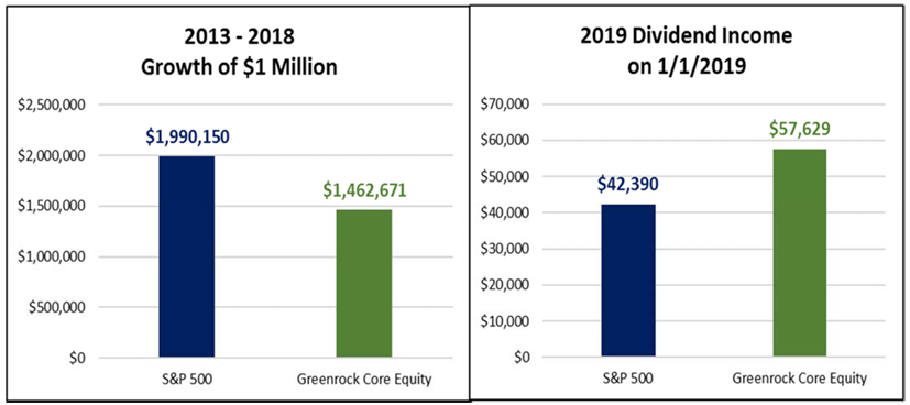
Why is this important?
Performance relative to a benchmark is what we think about, and often what our clients think about, in reviewing returns from investment portfolios. This is a disconnect from why clients retain your services. Clients come to you to reach their long‐term goals, and everyone’s long‐term goals includes income once they reach the distribution phase of their lives. Clients do not come to you to have portfolios that beat any index, domestic or international, even if they ask about relative performance from time to time.
Income in retirement is a necessity for almost every client that retains your services. So, having a strategy that develops income should be critical to your helping clients achieve their income goals. Many advisors rationalize the use of indexes like the S&P 500 by theorizing that in the accumulation phase of one’s life, indexes provide attractive, low cost returns. We agree that index funds are inexpensive, but growing dividend portfolios actually provide higher absolute returns long‐term. We would refer you to our white paper on this topic titled The Case for High and Growing Dividends. It shows that for the life of the S&P 500, 1958‐2018, growing dividend strategies provide a 22% better return than the index. If you do not have a copy, we are happy to send one to you.
So, why is so much money going into index strategies?
While this is a bit of a mystery to us, our best guess is an observation made by many that active management cannot beat an index. Today, you are hearing that theory often, and the reason is that for the last six years the S&P 500 has outperformed most active managers. The index is indiscriminate. If the P/E of the FAANG stocks gets to triple digits, the index just continues to buy. So, at times like now and like 1999, this theory of active managers underperforming indexes is widely reported. The problem with the theory is that when value starts to outperform growth like it did in 2000 for nine years, active management will outperform the S&P 500. In addition, growing dividend strategies will outperform the index.
Growing dividend strategies provide clients with returns in the accumulation and distribution phases that are less volatile than indexes
The GRR portfolios have higher returns than the S&P 500, 7.59% v 4.86%, a lower standard deviation, 9.32% v 14.54% and only capture 51% of the downside of the index.
In addition, these strategies solve your client’s investment income objectives. In good relative performance times like 2000‐2012, the income difference is dramatic, $86,256 v $26,638. In the times when growth outperforms value like we have been through over the last six years, the income difference at the end is still significant, $57,629 v $42,390. Chart 2 shows the returns of the 10‐Year for each calendar decade.
Chart 2 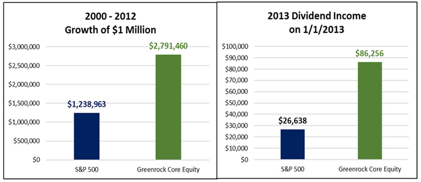
When do we return to the time of active manager outperforming?
While we obviously have no crystal ball, we think logically the answer is now. 2017 and the first part of 2018 is a period of irrational exuberance. For all of 2017 and January of 2018 the S&P 500 had increases in returns every month. There were promises of 4% GDP growth and an economy that would expand for a very long time. We did see GDP growth in Q2 and Q3 last year at very high levels, but Q4 brought us back to where we have been for the last 19 years. The advances of Q2 and Q3 have been attributed to the 2017 tax cuts. The issue with tax cuts adding to GDP growth is they are a single year phenomenon. The Fed target for GDP growth in 2019 is 2.1%, and it is hard to imagine investors going back to irrational exuberance when GDP growth is that low.
There are some other signs that double digit returns from the index may be over for now. The yield curve briefly inverted, which is an early sign that an economic slowdown or a recession may be in our near future. Critics of using the inverted yield curve as a sign of a future recession would point out that this measure has alerted us to ten of the last five recessions. While it is a fair criticism, it is still the Fed’s favorite indicator, and we think taking the Fed seriously is the prudent path.
Another widely reported issue is the length of the current expansion, the longest in history. While this expansion could go on even longer, it does make sense that at some point this will end.
The last point of concern we have is the high level of stock prices. They are certainly not at the crazy levels we saw in 1999, but they are clearly well above average. Whatever valuation you use, we cannot find anyone who is using valuation as a measure of future return and is predicting future returns over 5%.
So, while we do not know when, we like our position. While it is possible for the irrational exuberance to return, we think it is highly unlikely. What we do think will return is investors rewarding high quality, growing dividend portfolios.
Will we get returns that are attractive in the coming low GDP environment?
This is a fair question after six years of underperformance. The easy answer from us would be to refer you to the long‐term performance contained in the chart above. In order to believe that the index will continue to lead, one would need to believe the following:
- Crazy valuations will be a part of our future on some stocks.
- Concentration of the contribution to return from a few stocks will be a part of our future.
- Growth will continue to outperform value. 4. Value is dead.
While all of this is possible, we think it is highly, highly unlikely.